PORTFOLIO
Project Headspace Redesign
2023 ✿

Design UI/UX & Redesign Website
Headspace
Brand
Concept: Headspace is built on creative collaborations that align with its mission to make the world a healthier and happier place. Their philosophy is captured in the phrase:
“Meditation and mindfulness for any mind, any mood, any goal.”
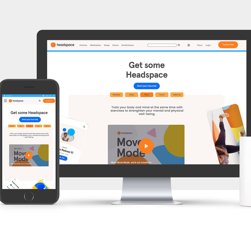
Why: This project was part of my BCIT graduation in UI/UX Design. The assignment involved redesigning the Headspace website and showcasing the new designs across various formats.
The Goal: The objective was to create a cleaner, simpler, and more consistent design while maintaining all the existing information.
Process: I began by capturing screenshots of the existing website across desktop, tablet, and mobile versions. Using these as a reference, I redesigned the interface, introducing new icons, improved navigation, and added interactive components like carousels, tabs, and toggle buttons. It was a rewarding experience to see the transformation and achieve a polished final result.
Pieces:
- Redesigned UI/UX for the Headspace website
- Desktop, Tablet, and Mobile versions
- Custom components and icons
Software: Adobe Illustrator, Photoshop, InDesign, and XD.
Redesign UI Elements
Redesign UI Elements for Headspace
Process: I developed new suggestions for the main navigation links, such as Sleep, Meditate, Stress, and Mindfulness, to improve clarity and usability. The content was rearranged to create a more intuitive flow, and I added dynamic components, including:
Tabs for organizing related information.
Carousels to showcase content interactively and efficiently.
Contrast design elements to enhance visual hierarchy and guide users through the site seamlessly.
These updates aimed to improve user navigation and enable visitors to access information more clearly and quickly, enhancing the overall experience.
Software: Adobe Illustrator, Photoshop, and XD.

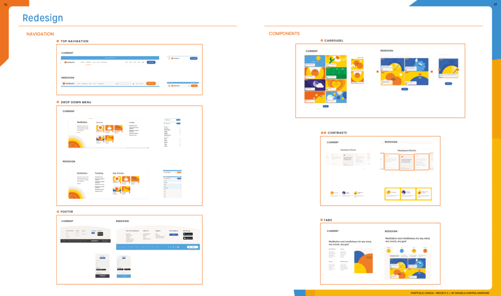

Why: The typography was updated to a similar font type, maintaining the brand’s essence while enhancing readability. The color scheme remained unchanged because it perfectly aligns with the brand’s fun and vibrant personality. New icons were suggested to add more character and ensure design consistency across the platform.
The Goal: To create a cleaner, more straightforward website while enhancing its fun and engaging nature. Functionalities were rearranged to allow users to access content more efficiently.
Process: I began by copying and analyzing the existing website, studying its icons and components. This analysis was followed by thorough research to develop suggestions for the new design and layout. These suggestions focused on improving usability while retaining the brand’s unique charm.
Software: Adobe Illustrator, Photoshop, InDesign, and XD.
Website Redesign
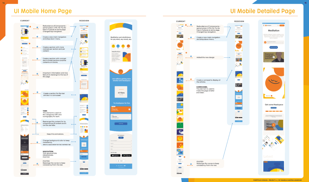
The redesign was carried out using Adobe Illustrator, where I incorporated all the components, icons, and functionalities that I had suggested based on my research. This process aimed to improve the website’s usability and enhance the user experience by introducing dynamic elements like carousels, tabs, and more intuitive navigation options. The goal was to maintain the website’s fun, clean, and simple appearance while making it more efficient for users to find and engage with content.


Website Redesign
The Goal: Create a website that is cleaner, more concise, with simple functionalities and components, while maintaining consistency and introducing new UI elements.
Process: I began by taking screenshots of all the existing pages and duplicating them. Then, I redesigned the elements in Adobe Illustrator, providing suggestions for each section of the page. These suggestions included new layouts, components, and UI elements, with detailed explanations for each recommendation to improve the user experience.
Software: Adobe Illustrator, Photoshop, XD, and InDesign.
MockUp
