
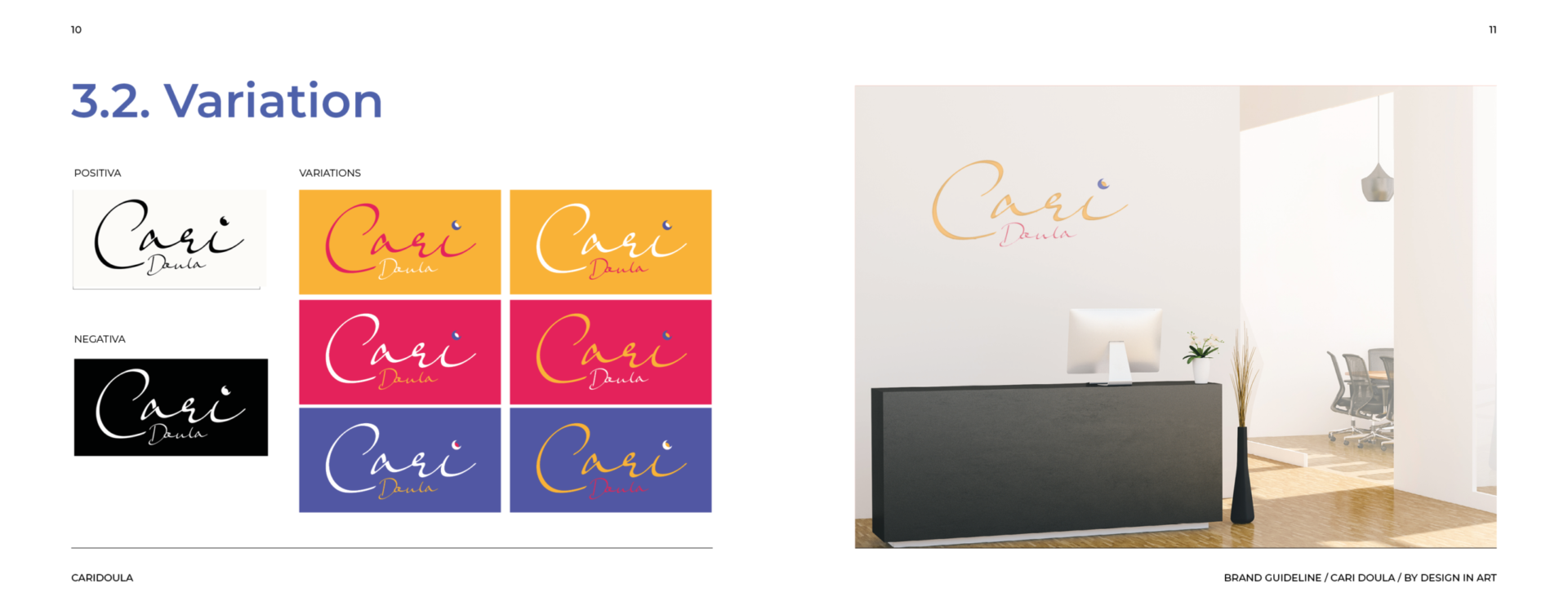
Caridoula
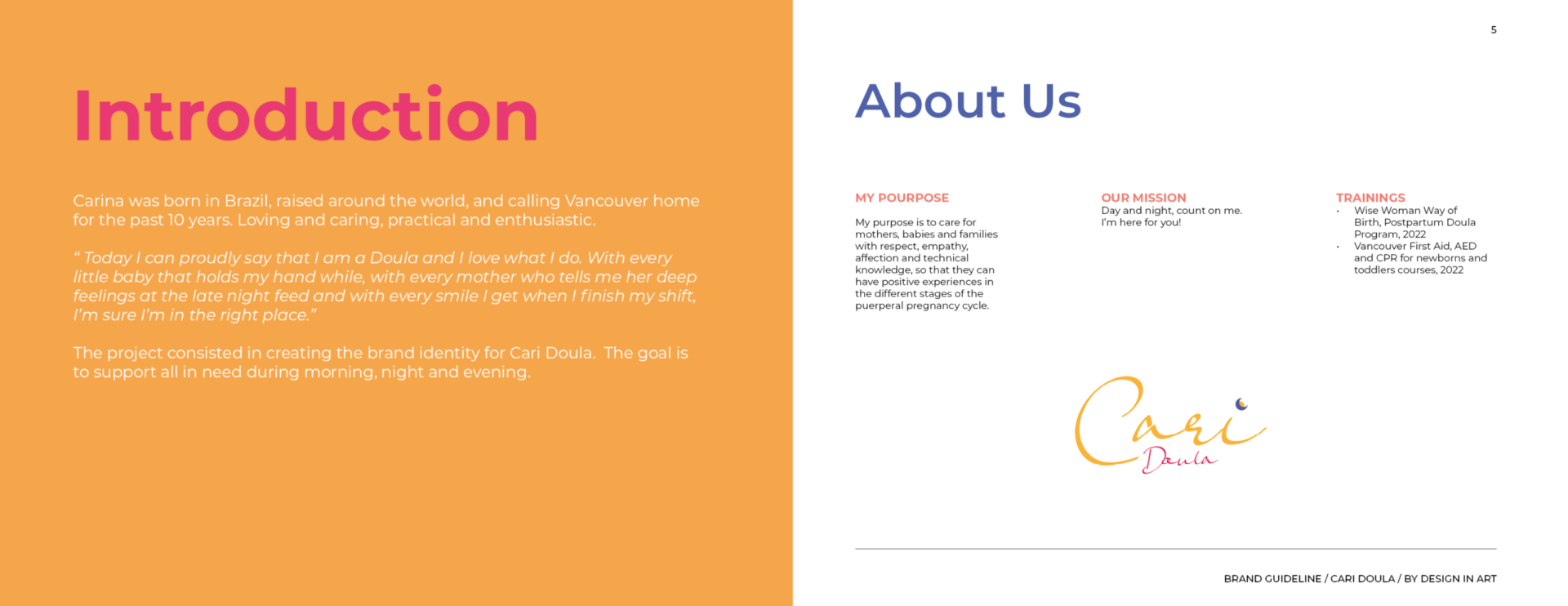
Concept: Working with Carina to bring her brand to life was a truly rewarding experience. Born in Brazil, raised around the world, and now calling Vancouver home for the past decade, Carina embodies a global perspective with a caring, practical, and enthusiastic nature. Creating her branding, website, and social media assets was a beautiful way to reflect her vibrant personality and professional expertise. ♡
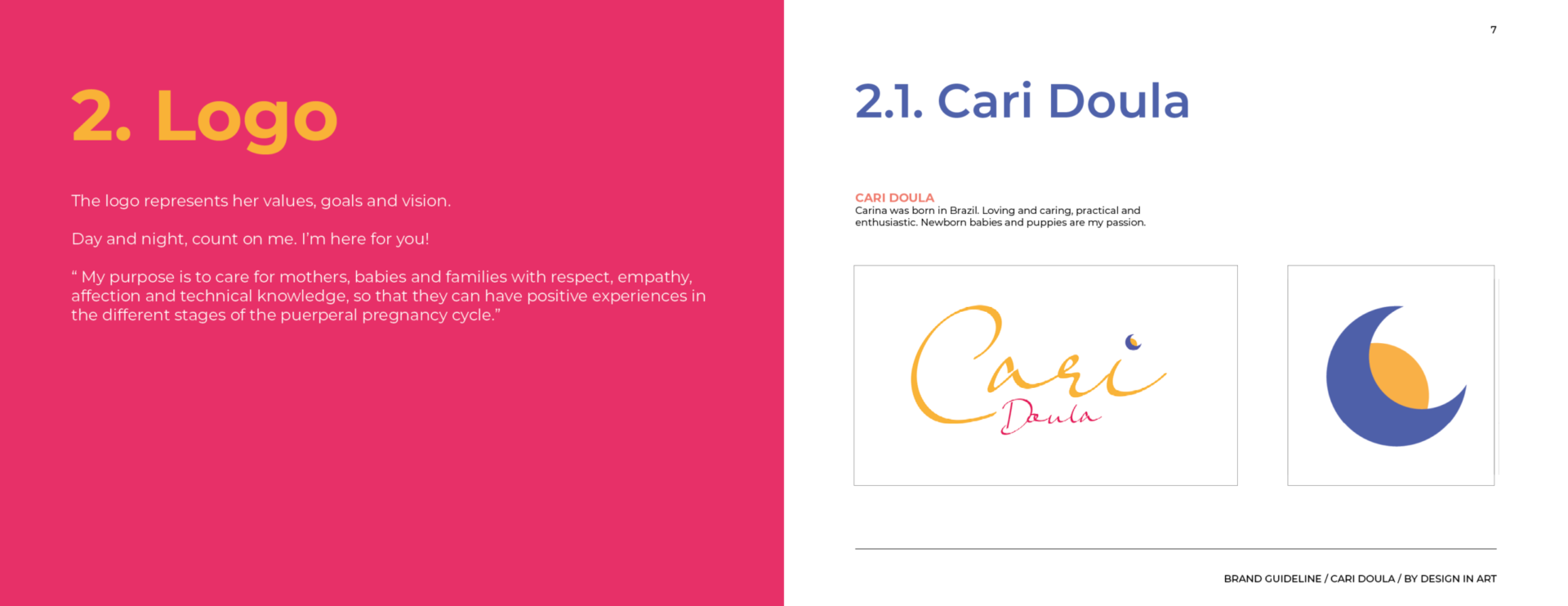
Why: Carina’s mission is to support mothers, babies, and families with compassion, respect, and technical knowledge, helping them navigate the different stages of the pregnancy and postpartum journey with positivity and confidence.
The Goal: To design a cohesive brand identity that captures Carina’s values and mission while reaching her audience online effectively. The goal was to create a warm and professional visual presence that resonates with her purpose and attracts clients.
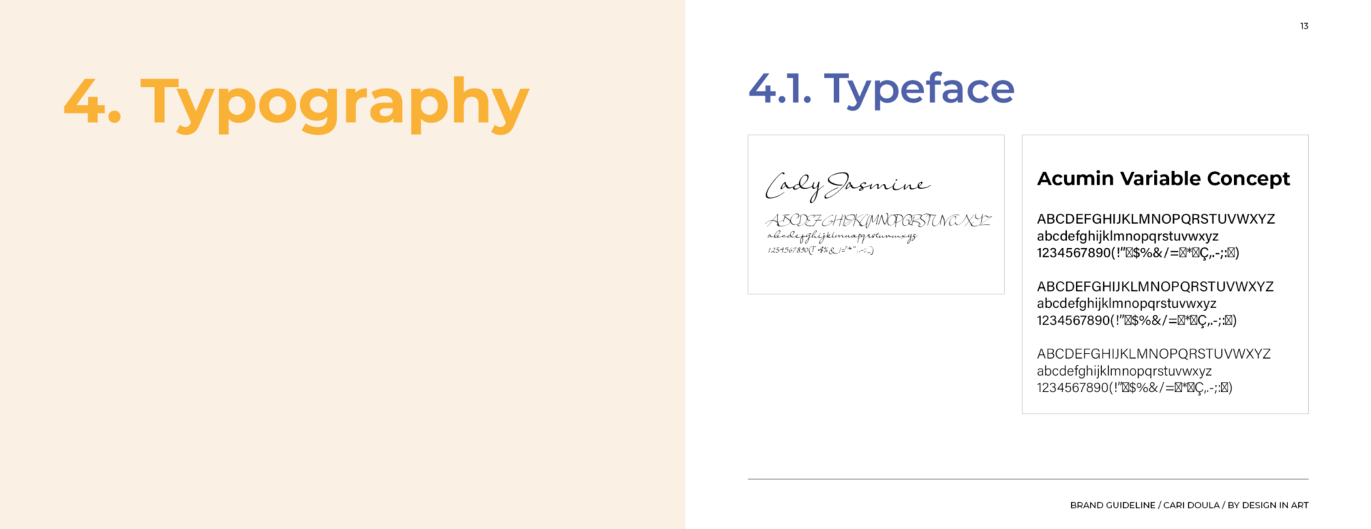
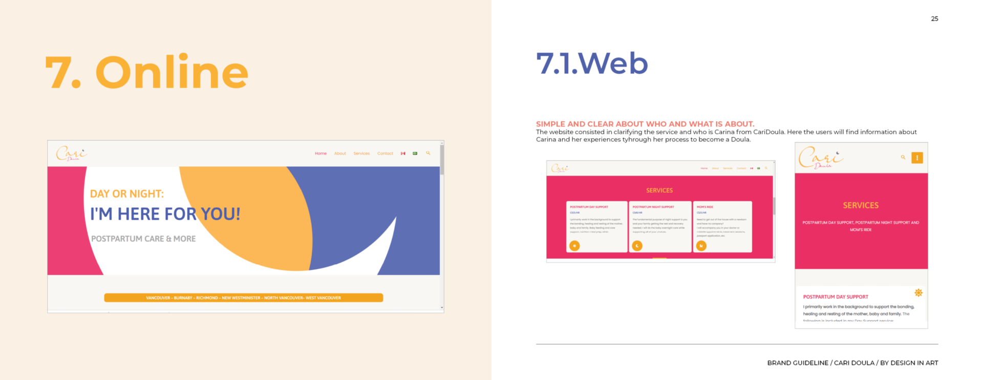
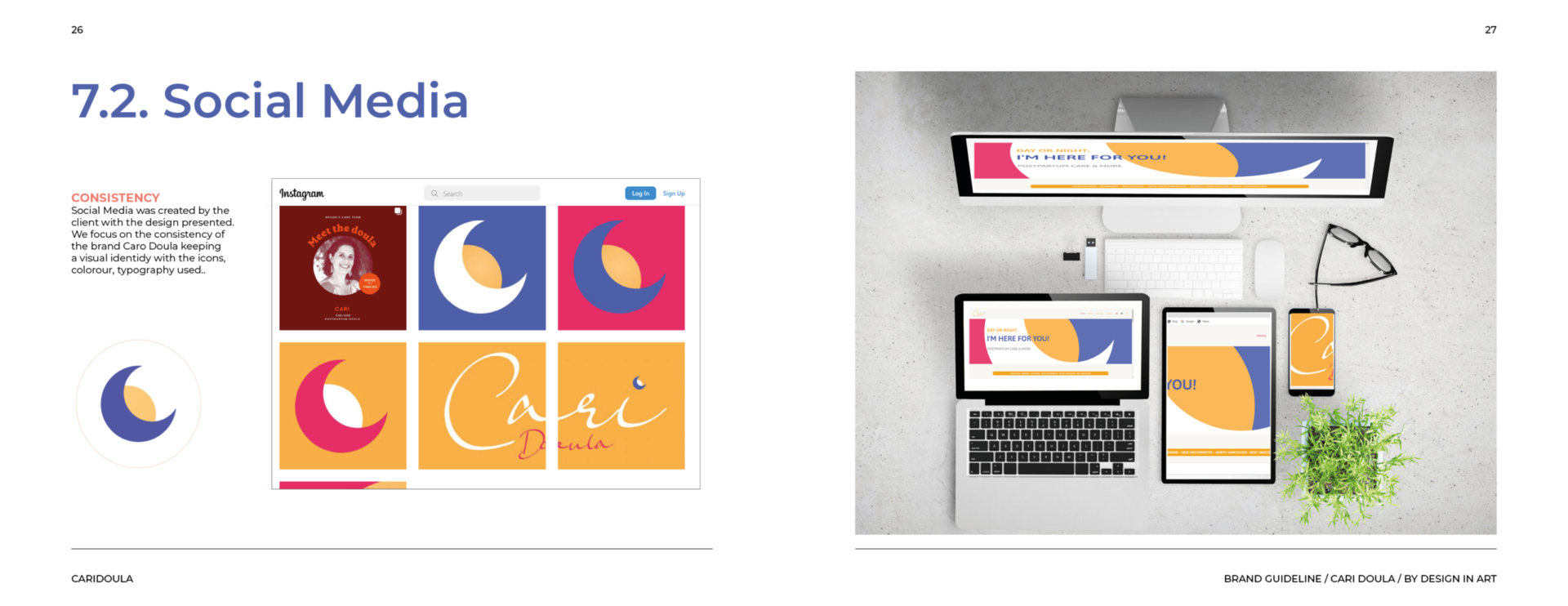
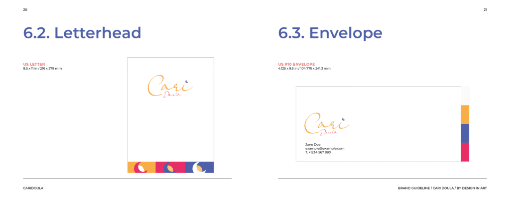
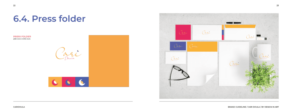
Process: The project began with thoughtful research and concept development to understand Carina’s vision. Once the typography, colors, and style were decided, I designed her logo, business card, and a responsive, user-friendly website. Each element was crafted to align with her mission and connect with her audience. Social media layouts and templates were also created to ensure her online presence is consistent and impactful across platforms like Facebook and Instagram.
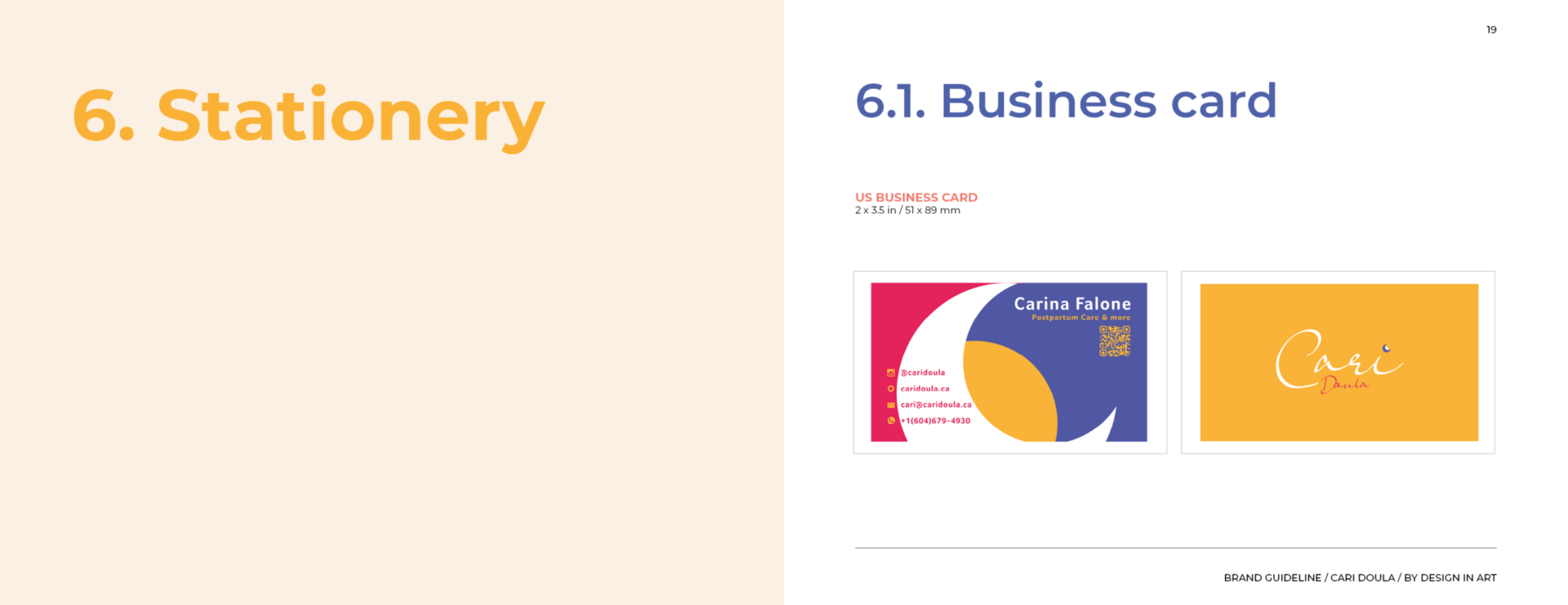
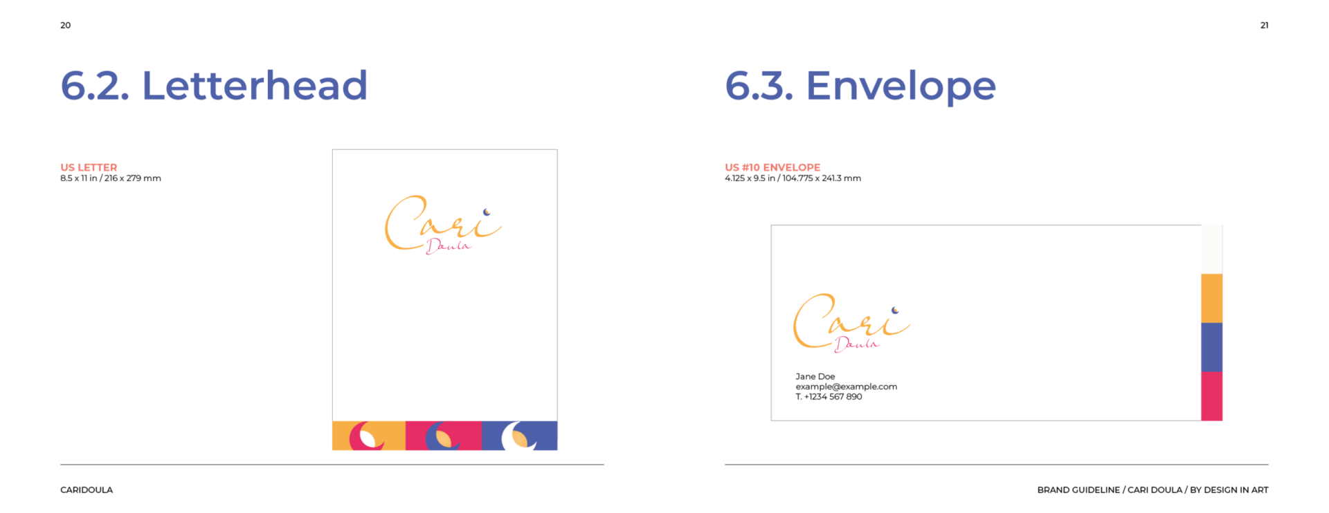
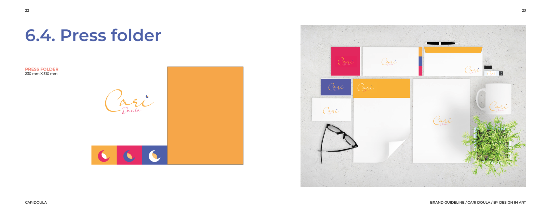
Pieces: Branding; Logo; Business Card; Website Design; Social Media Layouts and Templates.
Software: Adobe Illustrator, Photoshop, InDesign, and WordPress.

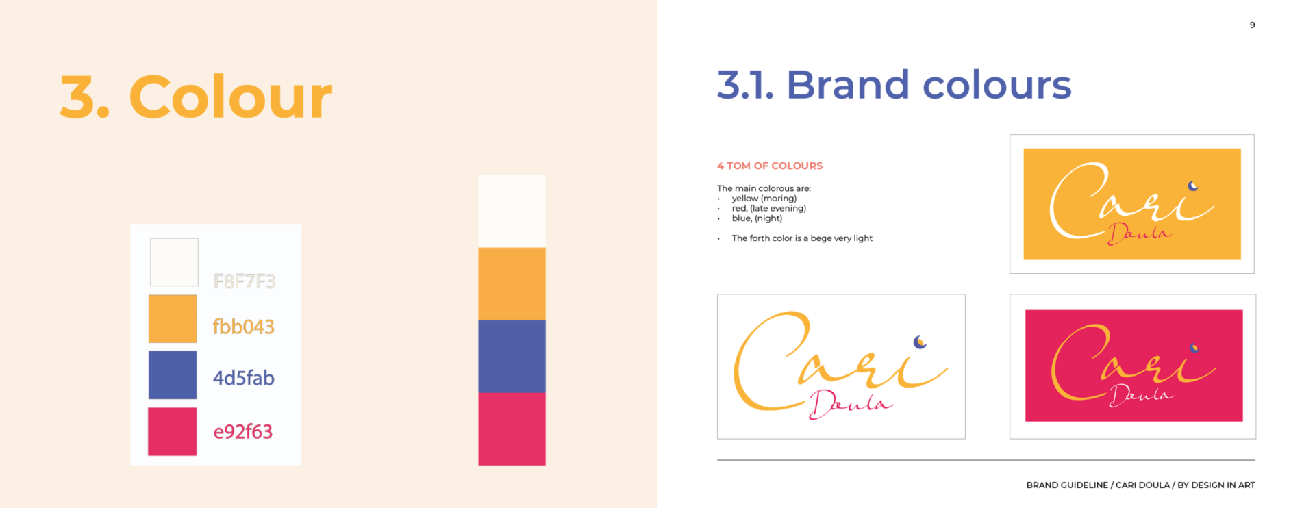


Dani brought light to the visual identity of my business. Literally! She was able to capture my purpose as a postpartum doula and introduced bright colors and elements that represent the soul of my work.
She is also a very committed professional who seeks excellence in what she does. I couldn’t be happier with the process and the end result.
Carina Soares
Cari Doula