PORTFOLIO
Les Delices de Maya
2013 ✿

Branding · Graphic Material (Business Card · Package) · Website
Les Delices de Maya
Brand
Concept: Creating a visual identity for Maya Midori was a delightful experience. Maya wanted to establish a recognizable brand for her business, enabling her clients to connect with her services, understand her offerings, and showcase her delightful menu. The goal was to create a cohesive, professional, and visually appealing identity.
Why: Maya needed a brand that would represent her culinary expertise and attract new clients. She sought to build a brand that would help her showcase her services, highlight her menu, and create recognition within her market.
The Goal: The main goal was to give Maya a distinct and polished brand identity that would help her attract new clients, generate more business opportunities, and inform her clients about her offerings in an appealing way.
Process: Once we decided on the typography, colors, and overall style, I started the project by creating the logo, which set the tone for the entire brand. From there, I designed a business card, various graphic materials like labels, menus, folders, and ads, followed by the website. This process involved researching and understanding the brand’s essence, ensuring that every design element reflected Maya’s values and vision. We also worked to create a digital catalog to allow easy access to her menu and services.
Software: Adobe Illustrator, Photoshop, Canva, Adobe InDesign, and WordPress.
Pieces Created:
- Branding: Logo, business card, and brand style guide.
- Marketing Materials: Labels, menu, folders, and ads.
- Digital Presence: Digital catalogs and a website to showcase her services and menu.
Graphic Design / Print format
Concept: For Les Délices de Maya, the goal was to design a cohesive and professional set of print materials that would help establish a strong brand identity in the physical space. The print designs aimed to reflect Maya’s culinary creativity while ensuring that each piece felt elegant, consistent, and functional for her clients.
Why: Maya wanted to ensure that her brand was easily recognizable not only online but also in her physical space, with print materials that would enhance the client experience. The designs needed to feel sophisticated and approachable, reflecting the quality of her services while being functional for practical use.
The Goal: The goal was to create print designs that seamlessly represented the brand across various touchpoints, from business cards to the restaurant sign. Each piece had to be visually appealing, aligned with her overall brand aesthetic, and functional in supporting her daily operations and customer interaction.
Process: The design process involved starting with the key brand elements—color palette, typography, and logo—and extending them to all print materials. I worked on creating designs that would work well both digitally and in physical formats, paying attention to how each material would be used in the restaurant environment.
The process included:
Business Cards: A clean, elegant design that communicated professionalism while including the essential contact details.
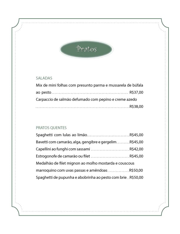
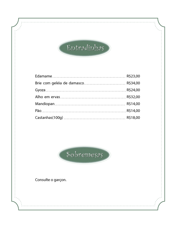
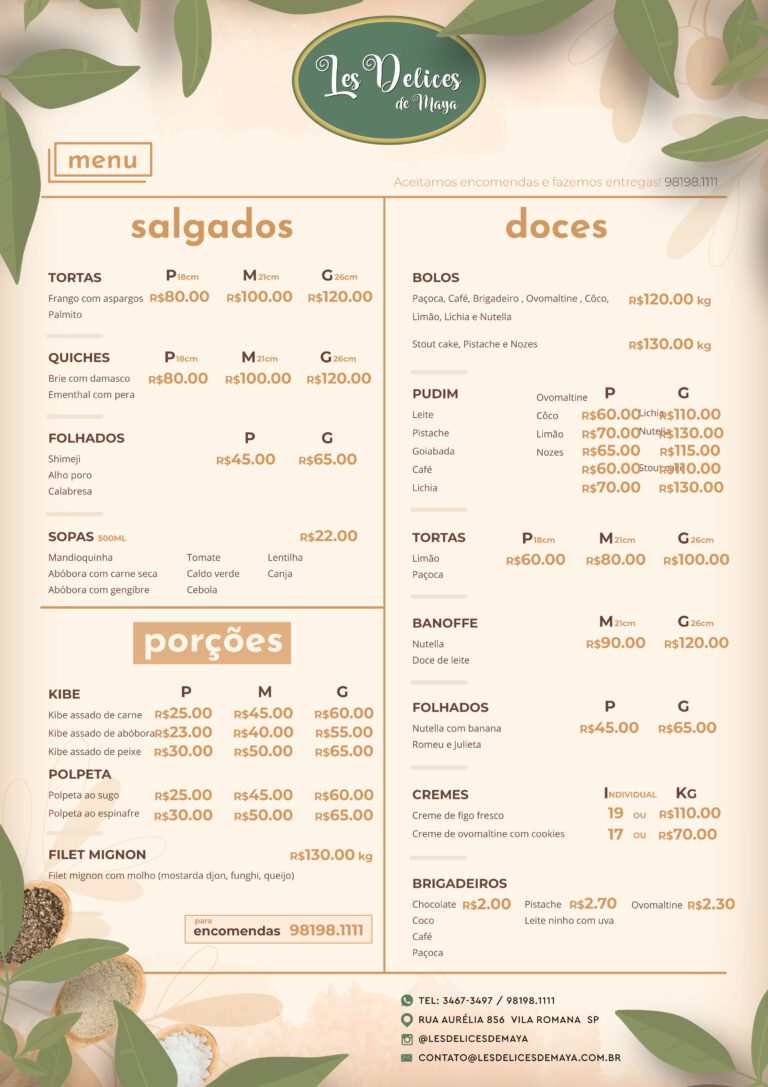
Menu Design: A layout that highlighted Maya’s offerings, was easy to read, and had a visually appealing arrangement that reflected her culinary identity.
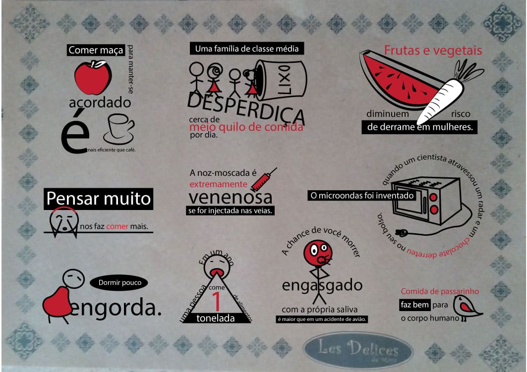
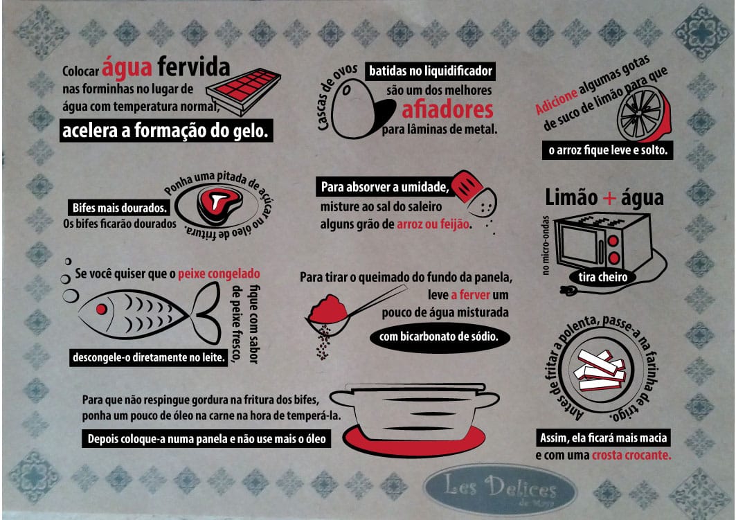
Labels & Table Prints: Labels for packaging and table prints that would enhance the dining experience. These materials needed to be simple yet sophisticated, easy to read, and align with the overall aesthetic.
Restaurant Sign (Plate): A design for the restaurant sign that would stand out and attract potential customers, while maintaining the elegance and simplicity of the brand.
Software: Adobe Illustrator, Photoshop, InDesign, and Canva
Business Card:
Design: A minimalistic and elegant business card, featuring the Les Délices de Maya logo, contact information, and a subtle nod to the food and culinary expertise with clean typography and color accents.
Goal: To create a professional first impression for new clients and contacts.
Menu Design:
Design: A well-organized, easy-to-read, and visually appealing menu with high-quality images and thoughtful layout that reflects the sophistication of Maya’s offerings.
Goal: To provide clients with a menu that not only lists dishes but enhances their dining experience.
Design: Small, eye-catching prints placed on tables featuring the logo, food items, or perhaps a special offer. These prints are designed to catch the diner’s attention without being overpowering.
Goal: To engage customers and provide additional information in a subtle and sophisticated way.
Labels:
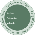
Design: Custom labels that can be used for food packaging or product packaging. The labels feature Maya’s logo, a clean font, and a layout that aligns with the restaurant’s aesthetic.
Goal: To elevate the brand image in every detail of the customer experience, including takeout or product packaging.
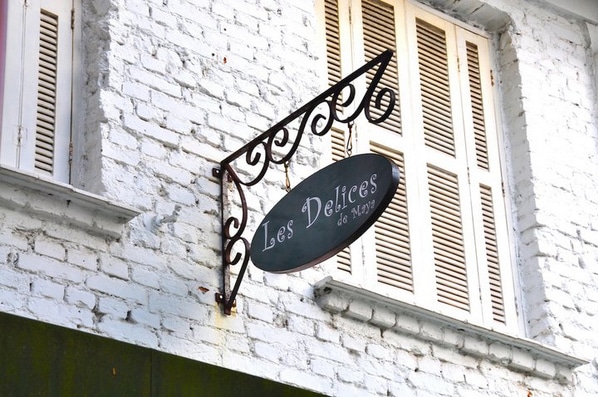
Design: A striking, yet simple sign that reflects the elegance of Les Délices de Maya. The sign uses the logo, brand colors, and clean typography to create a visual identity for the restaurant.
Goal: To create an inviting, recognizable sign that attracts customers and reinforces the brand.
Posters/Ads: Promotional material for special events, menu updates, or holiday-themed menus that would help increase customer engagement.
Flyers: Designed to highlight special offers or seasonal dishes, which could be distributed at local events or within the restaurant.
These print materials will help Les Délices de Maya establish a strong, consistent visual identity, making a lasting impression on her clients both inside the restaurant and through her promotional efforts.
Web Design
Webdesign and Webdevelopment
Concept: For the Les Délices de Maya website, the goal was to create an elegant, user-friendly, and visually appealing online space that reflected Maya Midori’s culinary skills and menu offerings. The design aimed to provide potential clients with a seamless experience that would inform them about the services, offer easy navigation through the menu, and attract new customers.
Why: Maya wanted a website that would give her brand a professional digital presence. It needed to effectively showcase her culinary expertise, menu, and services while being easily accessible to users, ensuring that clients could find what they were looking for quickly and efficiently.
The Goal: The main goal was to design a website that captured the essence of Les Délices de Maya, showcasing the unique offerings, seasonal menus, and providing contact information. The website had to be visually appealing, functional, and responsive across all devices (desktop, tablet, and mobile). Additionally, the design needed to emphasize ease of use and clarity, allowing clients to learn about the services, view the menu, and contact Maya for bookings.
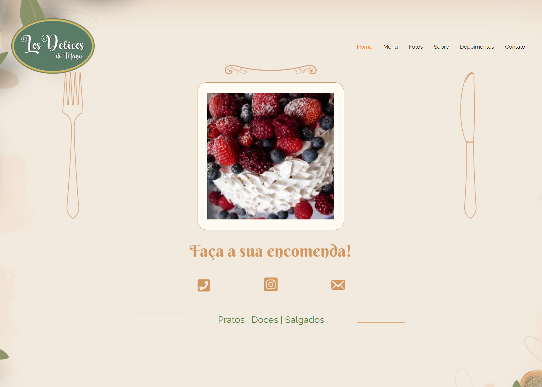
Process: The design process began with understanding the brand’s visual identity and tone. Using the established branding elements (such as logo, colors, and typography), I created wireframes and layouts to establish a clear structure. I focused on a simple and clean design that highlighted the food and services, with a focus on user experience and intuitive navigation. After creating the site’s framework, I developed a fully responsive design in WordPress, ensuring it would perform well across all devices. Visual content, including images of Maya’s dishes and branding materials, was incorporated throughout the website to enhance the appeal.
Software: Adobe Illustrator, Photoshop, Canva, Adobe InDesign, and WordPress.
Key Website Elements:
- Homepage: Eye-catching visuals and clear navigation to services, menu, and contact.
- Menu Page: Organized, easy-to-read, and visually appealing digital menu.
- About Page: Information about Maya’s culinary expertise and services.
- Contact Page: Easy-to-find contact form for booking inquiries.
- Mobile Optimization: Fully responsive design for easy navigation on mobile and tablet devices.
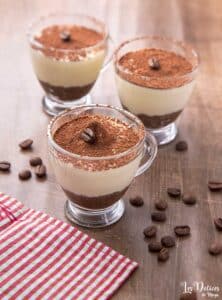
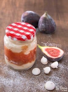
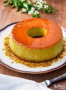
- Visual Content: High-quality images of Maya’s dishes and branding materials, providing a visual connection to the brand.
MockUp
Dani was able to helped me with all the visual Communication of my business. I didn’t need to look for other professionals to divulgate and complete my entire project. She managed to meet all the needs for me to promote my company. She was able to take my ideas and develop a visual identity adapted for all formats. She created and delivered everything from labels, menus, packaging to the website and all brand development with the logo and all digital material. Everything was impeccable, and my clients were impressed, generating much more flow and income for my business.
Chef Maya Midouri
Les Delices de Maya
